
Table of Contents
1. The "Time to Value" Rule
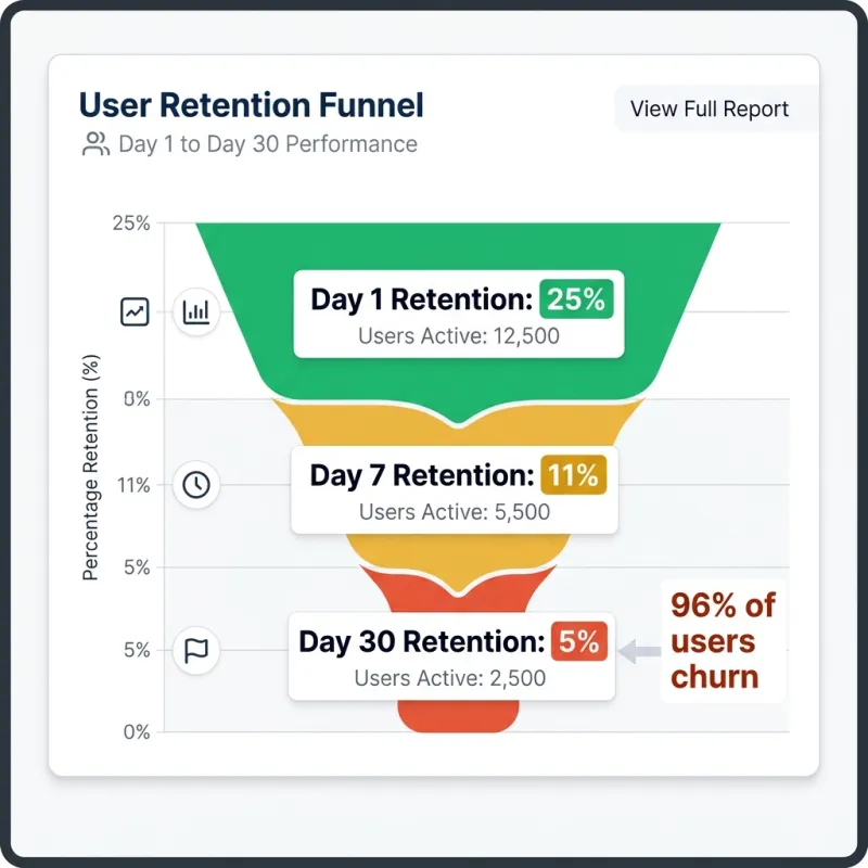
A staggering 96% of users churn within 30 days. To combat this, your onboarding must deliver "Time to Value" (TTV) within the first 60 seconds. Do not gate core features behind lengthy sign-ups; offer a guest mode to prove immediate utility.
2. Progressive Disclosure UX
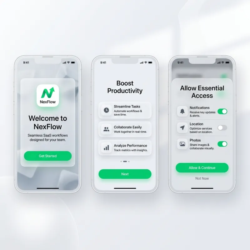
Ditch the 5-screen static tutorial carousels. Instead, use progressive disclosure: reveal complex features incrementally via contextual tooltips only when the user is naturally navigating toward them.

3. Ergonomics and Thumb-Zone Design
Place primary actions in the bottom two-thirds of the screen. Ensure tap targets meet the 44x44pt (Apple) or 48x48dp (Android) minimums to prevent frustration during the critical first session.
4. Frictionless Auth and Habit Loops
Adopt passkeys or OTP logins as a baseline. To secure Day-30 retention, engineer a habit loop (Trigger → Action → Reward) by guiding the user to complete at least one core meaningful action immediately.
For more strategies, see the mobile app founders checklist and our mobile app development services.


